London study trip -Hoyland & Auerbach – 16th January 2016

VISIT TO THE DAMIEN HIRST GALLERY AND THE TATE BRITAIN


On a cold but bright sunny Saturday morning in January I attended my first OCA study visit.

The group met OCA tutor Gerald Deslandes at the Damien Hirst Newport street gallery in Lambeth.

The Newport gallery opened 3 months ago by artist Damien Hirst to showcase his personal art collections. John Hoyland’s power stations paintings 1964-1982 is the gallery’s first exhibition.

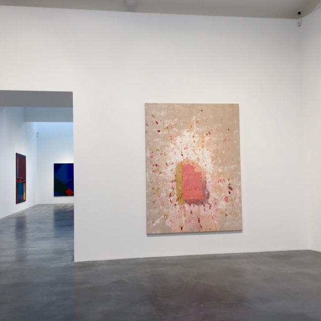
The gallery is an impressive Victorian building that has been converted into a spacious , modern , light white cube space. I was impressed by the use of the space the gallery is housed on two floors with stairwells with viewing areas to look down onto the art works below.

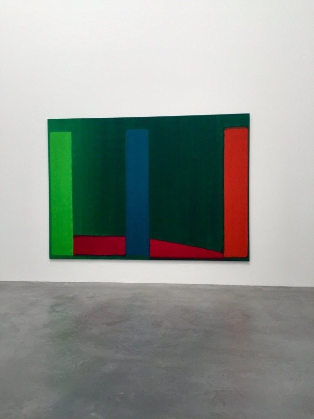
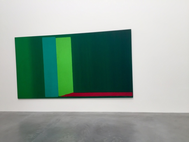
John Hoyland was born in 1934  he was a British abstract artist. We started by looking at Hoylands earlier paintings. Gerald began by asking the group to chose a painting which we then discussed. We then had an interesting discussion  on abstract art – these are some of our collective thoughts :

  • we felt abstract art can be about creating an image and exploring some of the relationships between colour and emotions.
  • the artist could be using the painting to create an illusion
  • some of Hoyland’s early paintings give the viewer the v sense that they could fall into the painting
  • Hoyland used red a lot in his early works and we were fairly divided on what we felt the red colour represented some ideas were emotions, fire,hot,passion,  calm, dangerous
  • is abstract art primarily about decision making?
  • is abstract art subjective?
  • is it about emotions?
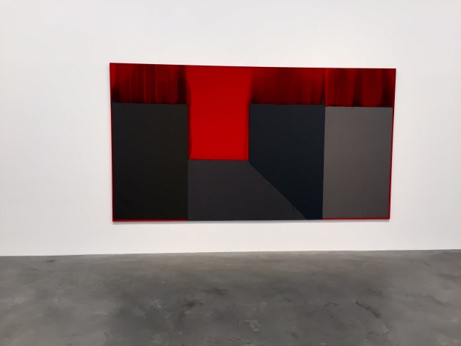
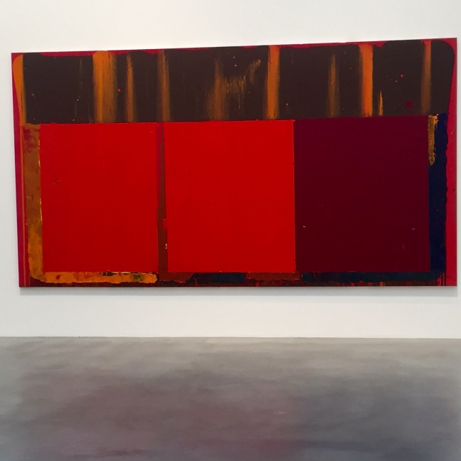
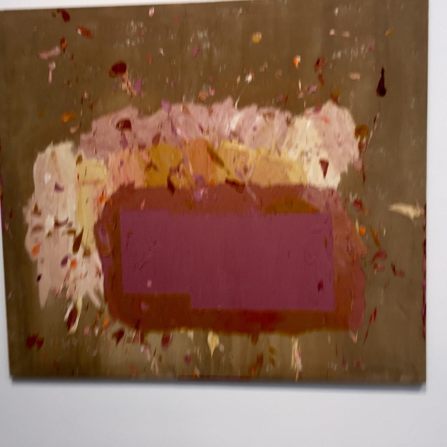
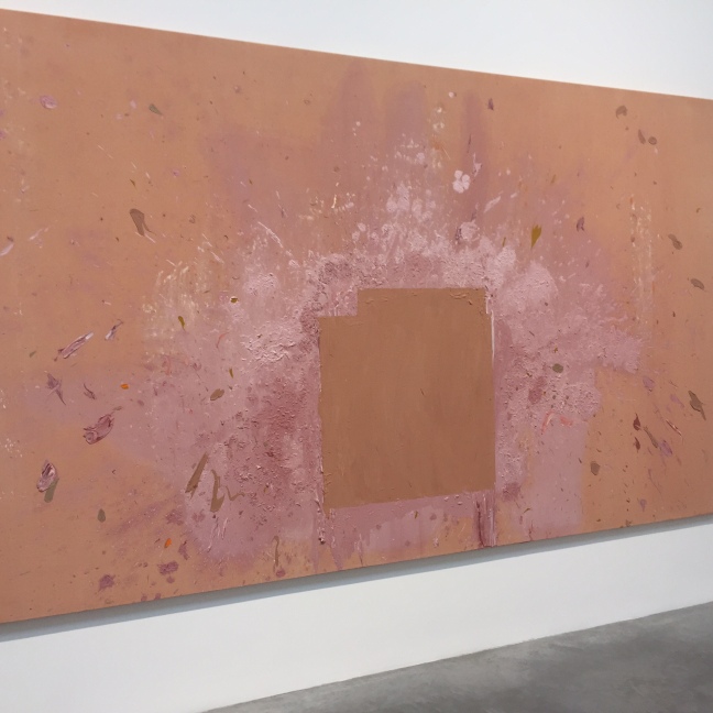
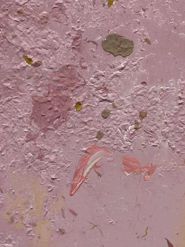
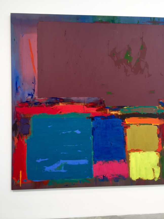
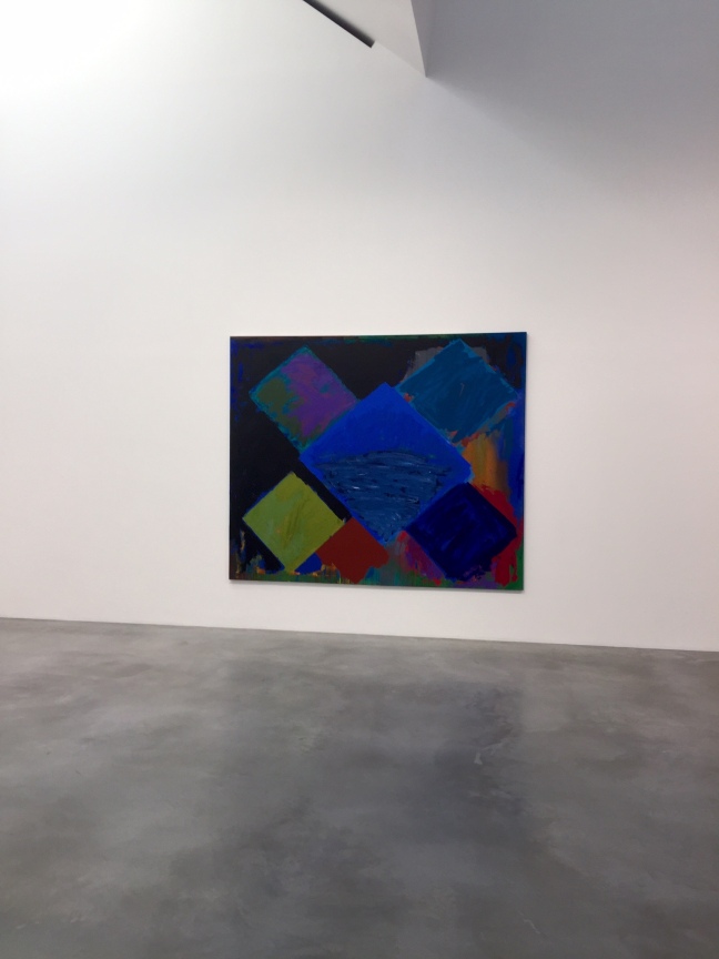
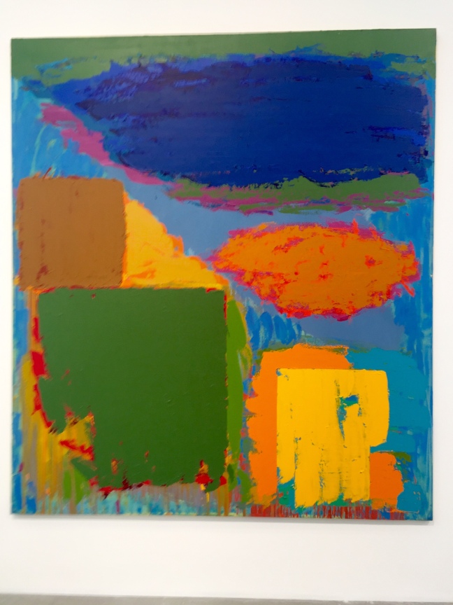
  • is there a sense of harmony , a sense of mood . We all agreed that Hoyland appears to have been careful in how the colours were placed onto the canvas and there was a sense of something happening underneath the painting. There is deliberate blurring of colours and blocks of pure colour. The colours themselves look contemporary as they are very industrial looking with acid hues. Looking closely at the paintings we wondered whether Hoyland has used a roller to apply some of the geometric blocks of colour?    The later paintings in the upstairs galleries explore different  paint effects impasto layers of thick paint , he introduced more colours  into his pallet and there are splashes of paint on the canvas and some areas of the paint are deliberately rubbed off.

The paintings of the 1970’s  leading into the 1980’s have a change of visual language – the colours are pink and sugary with added texture some of the group remarked that the colours were like sickly cupcakes and a joyful festival.

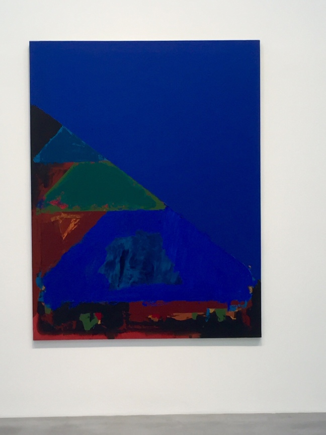
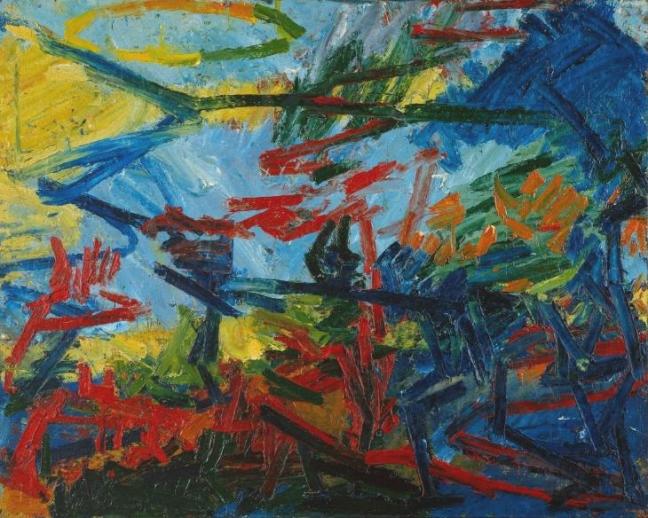
the later painting up to the 1980’s again change in nature moving from geometric forms to including reference to the outside world. There is a use of bold bright primary colours leaving behind the sugary and acid hues. The vivid blue colour is reminiscent of  the Mediterranean Sea , hot and sunny. These paintings are definitely like illusions as there is a sense that the viewer is looking at a harbour sweeping out to a vivid blue sea. I really liked these paintings as they were fun and joyful.

MY PERSONAL THOUGHTS ON  HOYLAND EXHIBITION

I really enjoyed the exhibition the gallery was nice and the art was hung well.  We were also allowed to take non flash photographs. The large white walls and the pale grey flooring enhanced the large expansive paintings. I particularly enjoyed the visual experience of the later art. But ,I did in general  feel that the paintings on the whole did not reveal anything about Hoylands personality or emotions. Also to me they Didn’t  offer anything new as Hoyland ‘s paintings somehow seemed fairly standard abstract paintings of the time. They really did not offer anything that had not been done before. I really enjoyed our group discussion and Gerald led the discussions in a very knowledgeable and interesting manner.


imageimageimageimageimageimageimageimageimageimageimageimage


FRANK AUERBACH

After leaving Newport street we walked to the Tate Britain to visit the Frank Auerbach exhibition. First impressions Auerbach’s work seemed a complete contrast to Hoyland’s work. Auerbach now in his 80’s is still an active artist.

The exhibition covers Auerbach’s work from the 1950’s to the present decade. What was immediately evident is that many of the  common themes in Auebach’s work is represented in all of his work over the 60 years covered in the exhibition.

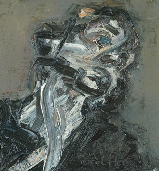
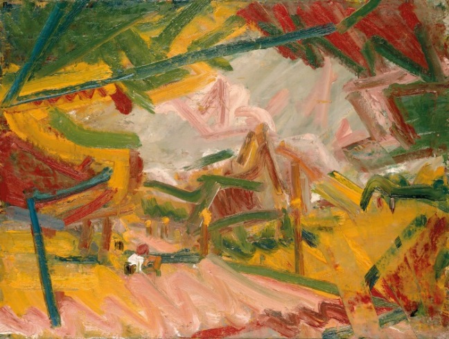
Auerbach applies his paint ( mainly oils) in thick painstaking layers of colour. Many of the paint layers are several inches in width adding a structural heavy quality to the paintings. I feel the paint has been worked on over a period of time allowing a gradual process of building up the colours and composition. The paintings literally appeared to come alive when viewed from a distance.

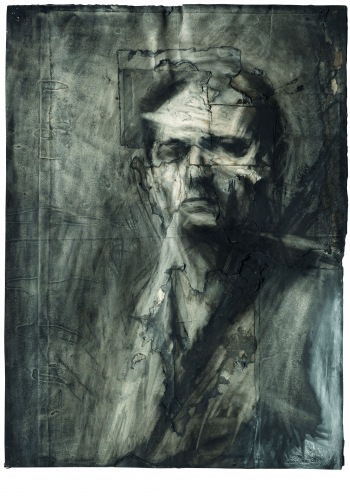
i found Auerbach’s portraits very intriguing as he is mainly interested in the plains and structure of the whole head he does not appear to be concerned with minute details such as the eyes and hair, facial features are represented in a sketchy manner – yet these portraits seem very much alive and real.Most of the portraits are just of reclining heads and they had no obvious gender. I really liked Auerbach’s charcoal portrait drawings the way he uses simple marks to suggest the plains of the face and the character and personality of the sitter. These drawing have a clever simplicity with blending , scribbling and erasing the lighter tones yet they are very effective and emotive.  I liked his drawing ‘ David Landau seated ‘ as Auerbach includes the sitters hands which are simply and sparingly suggested with minimal details , yet the drawing really works.

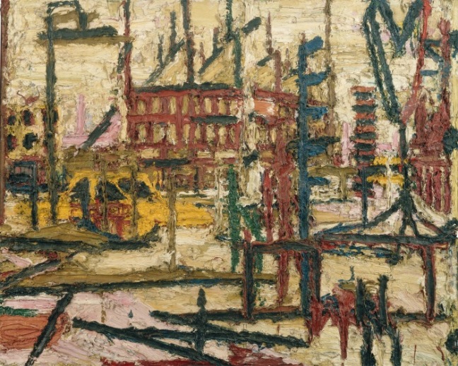
Another recurring  theme of the exhibition is Auerbach’s large paintings of North London. These paintings are very bright with his customary thick impasto paint layers.  Bright primary yellow paint features in many of these paintings. I liked the way Auerbach appears to draw with his medium, building up lines and texture with the paint. Some of the later views of Camden in the 1990’s demonstrate a fluid handling of the paint which to me effectively convey’s light and feeling into the composition. A good example of this momentarily different handling of paint is ‘Albert street 11 ‘ . These paintings are also on a much smaller scale.

The last section of the exhibition is a mixed example of Frank Auerbach’s work curated by Catherine Lampert. There was an portrait in charcoal of Catherine Lampert dated 1985. The drawing is large and unlike many of his other head drawings he seemed to be more focused on Catherine’s individual features as he includes her flowing hair which gives her a very youthful and feminine appearance. Also in this section of the exhibition there was an interesting large interior view of Auerbach’s studio space from the 1980’s that cleverly convey’s a sense of space.

MY PERSONAL  THOUGHTS ON FRANK AUERBACH EXHIBITION

on the whole I really enjoyed the Frank Auerbach exhibition and I  especially liked his use of charcoal and chalk to convey a sense of liveliness in his many portrait studies. I thought these drawing were very emotive and intimate. I didn’t really like his Camden  paintings they to me seemed to lack that special spark that his oil portraits have. Although I did like the composition of ‘Albert street 11 ‘.

I did feel that Auerbach seemed to stick to painting the same things unlike other British artists such as Hockney who seems to be always exploring new things, Auerbach paints what he knows – whether this is true of the whole of his career I do not know? Or did the curator of the show choose to focus on Auerbach’s Camden work and his head studies?

I really feel I need to find out more about his work as I left the exhibition with many unanswered questions.


image

Bacchus and Ariadne 1971 by Frank Auerbach born 1931
Bacchus and Ariadne 1971 Frank Auerbach born 1931 Presented by the executors of the estate of David Wilkie 1993 http://www.tate.org.uk/art/work/T06687

imageimageimage


This was my first OCA study visit and I really found it inspiring and insightful. I found Gerald led the group well and I enjoyed meeting my fellow students and sharing with them their experiences of studying , this is particularly useful as distance learning often feels isolating and challenging.


My feelings about drawing one part two

Drawing one part 2 has been an interesting and in many ways an enlightening experience for me. I found that I had a few problems engaging with part one so started part 2 feeling very apprehensive

however I really enjoyed the content and structure of part 2. I was challenged and had some bad times as I was ill for 3 weeks during December.

i liked using some colour and experimenting with different mediums. I still have a long way to go with mastering many techniques and with experimenting.

I do however despite the many ups and down feel I have made some progess and some elements of my drawing has improved since starting this course 4 months ago.

I did struggle with some of the exercises particularly pets and animals using source resources.

i do have grave worries with assignment 2 – it is definitely not my best drawing and I am not at all happy with it

i enjoyed very much the research projects and discovering new artists.

drawing one – assignment 2


the brief for this assignment is to do either a still life, animal studies or an interior scene or a combination. Also to demonstrate colour in drawing, use of medium , composition, mark making, contrasts of line and form and tone. Also to experiment with ideas , method and tone.

Looking back at the work I have produced I decided that interiors had been challenging but very refreshing and interesting .

I did some on site sketches of a local pub in Greenwich – which is inside the covered in market – so that the outdoor seating areas are under cover. This area is where I worked. I did some sketches of the area and colour notes – I also drew some people in the area. I made a mood board using some notes and some cut out details from a couple of digital photos.

i had planned to do the final piece in pastel but found I had no large pastel paper left and due to illness I was behind so did not  have time to go and buy some. So I decided to do a mixed media piece instead. I began by sticking a few torn pages from an old radio times magazine on to some heavy duty paper. Using pen I mapped out my composition and used oil pastels and coloured pens to fill out the tones. I also used white drawing ink.

I feel that my drawing does not work the composition does not seem to flow well And does not flow – I think I used the wrong medium – I would have liked to have started again but I have run out of time. I feel that I need to re- work the assignment as I am not happy with it. I feel the drawing is too confusing and is definitely not my best work.image.jpegimage.jpegimage.jpegimageimageimage

Interiors exercise5- mixed media

For this project using mixed media – coloured pens, pencil, collage and oil pastels I decided to focus on the clutter in my home – ‘clutter or treasure’

I did four drawings – 2 on each piece of a2 paper.

i used a variety of media Including using newspaper and discarded post for areas of collage. I really enjoyed using oil pastels and found they blended well and I enjoyed layering them to produce tone,

i went into the living and dining rooms drawing items on the shelves – I drew the clock on the mantle piece with faux flowers, I drew a shelve containing glue, painting brushes, a red crate and folders, I drew two shelves from the dresser and another shelf with a twig tree, a white figurine and a mirror.

i really enjoyed working on this project and feel I am making some progess with mixed media. I also feel my drawing work well to ‘explain ‘ household clutterimage.jpegimageimageimage.jpeg

Exercise 4 interiors line and wash

image
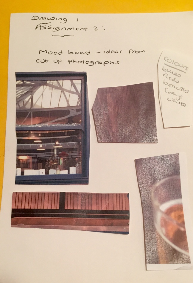
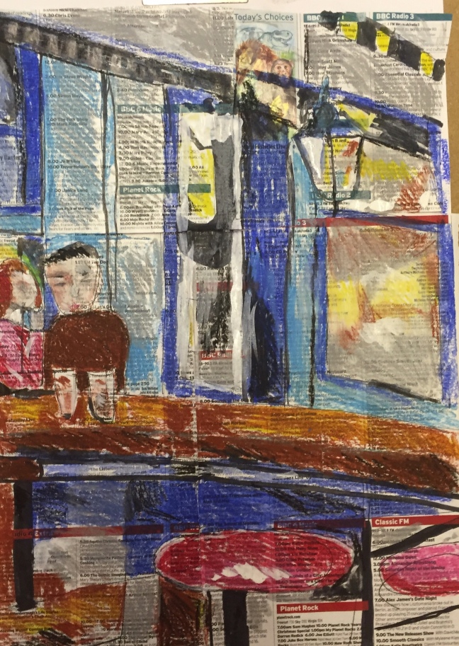
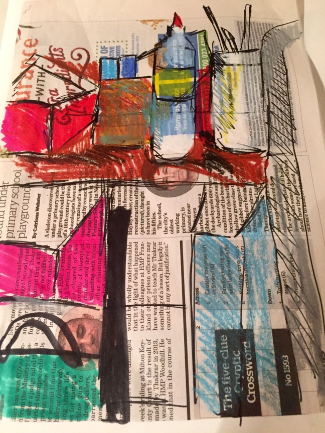
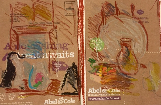
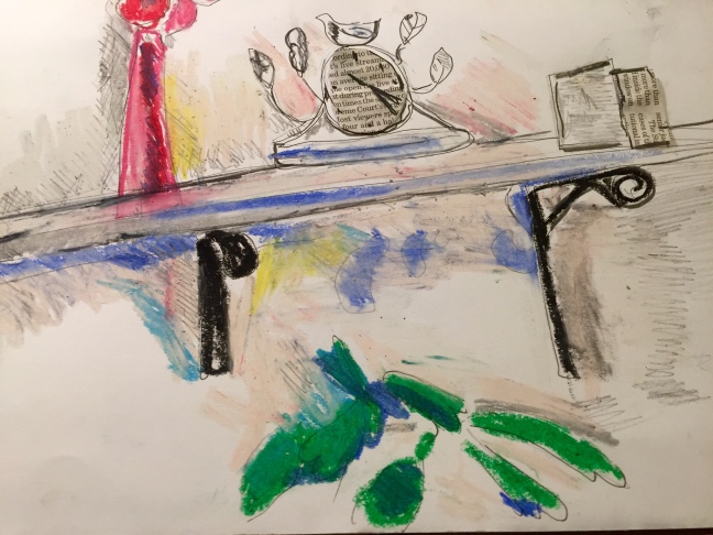
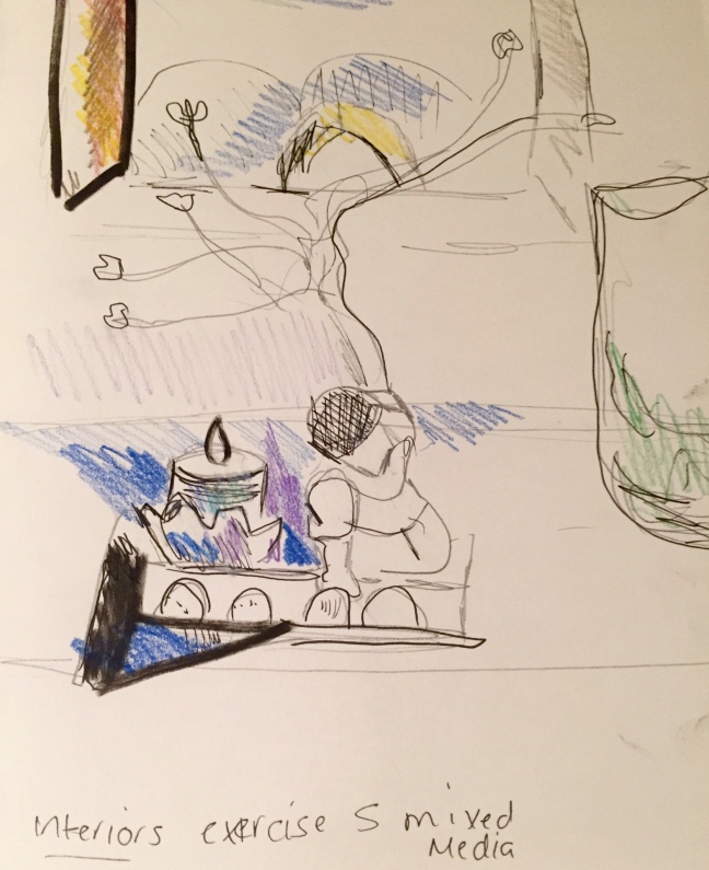
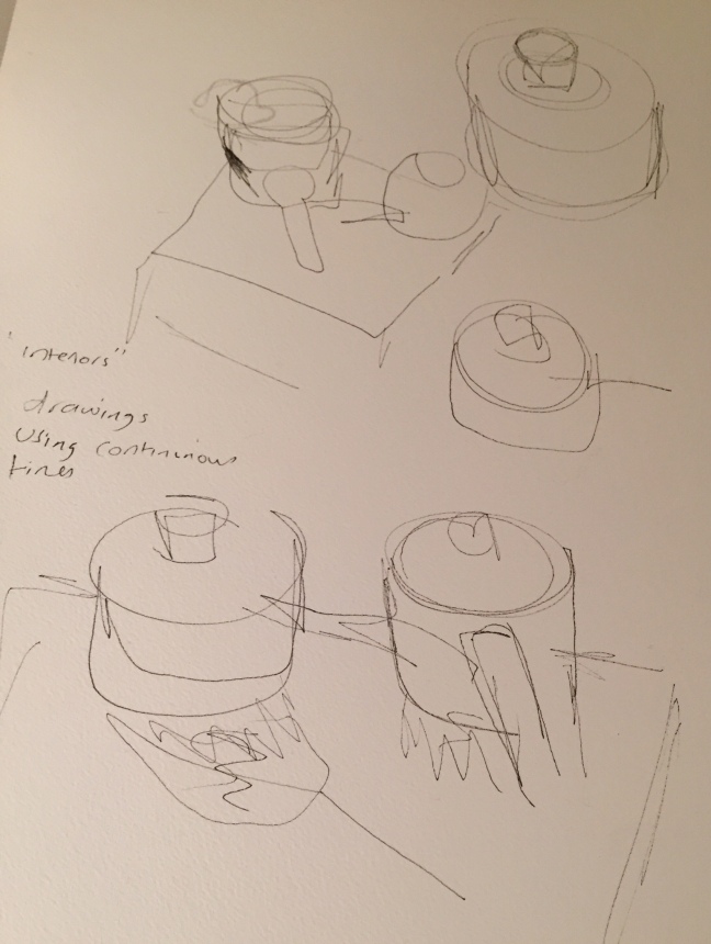
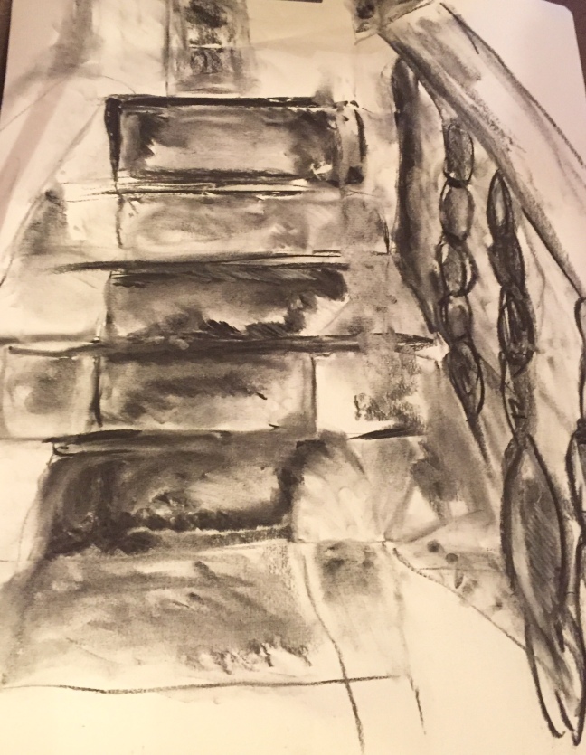
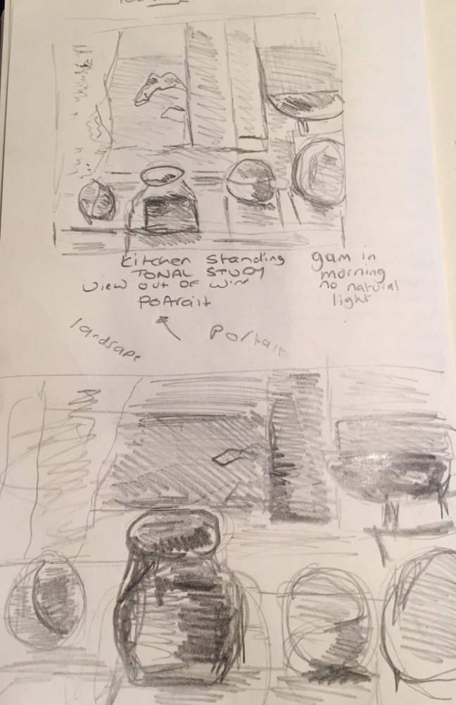
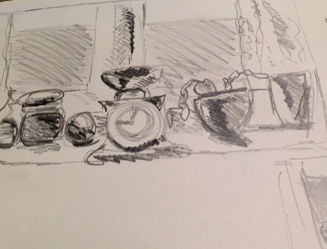
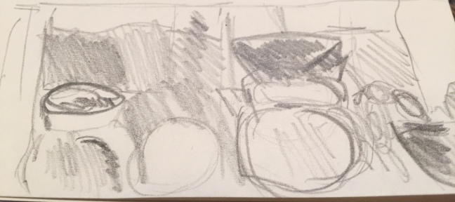
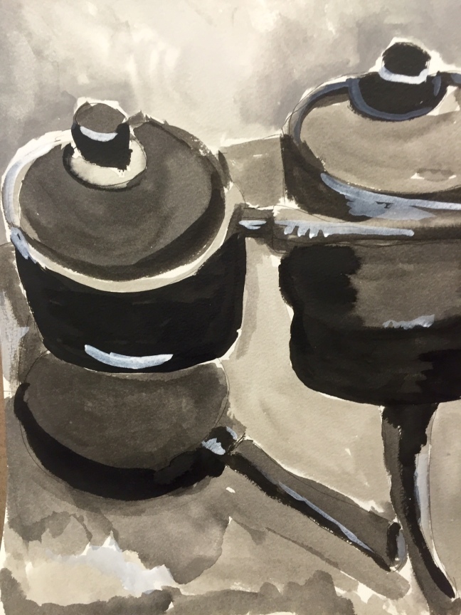
The idea is to experiment using different media to create line and wash.

I decided to draw in the kitchen – I was going to draw the gas oven but I was drawn to the shapes and reflections made by the two saucepans on top of the glass cooker top.

i began by using a black Pitt pen drawing quick outlines – I used the continuous line technique drawing without moving the pen from the page.

once I had warmed up I drew again with pen onto textured watercolour paper. Once I was happy with my drawing using black drawing ink and a brush I did several washes mapping out the various tones adding water to dilute the ink as required. Once I had finished I used small amounts of white paint to hi light where the light fell on the dark areas of the saucepans.

overall I am quite happy with my drawing I am new to using drawing ink so do feel I still need to master some techniques and will need to practice some more with producing washes.image

Exercise 3 – tonal study – interior

the object of this exercise is to do a tonal study.

i used A2 paper charcoal , a white pencil and a putty rubber.

i sketched the the hall sitting on a chair at the bottom of the stairs , I  placed my drawing board on my easel I drew the view looking up the stairs. I began by lightly sketching the shapes as it was an unusual composition I carefully noticed that there were a lot of angles and triangle shapes. I then noted the shadows it was a dull afternoon with a muted light. I then added tone using charcoal and smudging it as I went along with my hand and putty rubber. I also screwed up my eyes to record the darkest areas the middle of the individual stairs and the banisters. I added some hatching using a white charcoal pencil.

overall I was quite pleased with my drawing particularly as it was a challenging composition with odd angles – I do feel I still need to work more on perspective.

image

Research point – interiors

The brief is to find contemporary artists that have included domestic interiors in there work and to analysis their choice of content , medium and format etc.

looking at online resources it did become clear to me that interior scenes have always played a major part in an artists development and as a genre has played a major part in the history of art.

The Danish artist Vilhelm Hammershoi 1864-1916 painted large oils of interiors often containing a solitary figure  viewed from behind. What I particularly like about Hammershoi is how he captured the Scandinavian light and shadows with a  cool palette  his paintings are literally suffused with light- there is also a real sense of space within his compositions and he was clearly an excellent draftsman.

During the 1950’s the art world seemed to be  very much influenced by fashion and culture – maybe this was an reaction to the end of the  war years and they were embracing the end austerity. Many popular artists including Richard Hamilton, and Edvardo Poalozzi featured interiors of kitchens often showing off modern kitchen designs including new appliances.

These works have almost a commercial quality to them as though they are selling a lifestyle. Many of the artists used different mediums including ,screen printing , mixed media and acrylic paints. The post war years were a time of experimenting with new mediums

Richard Hamilton produced mixed media collages of interior scenes with a quirky sense of humour to his work

Artists of the 1950s and 1960s also produced work that reflected the fashion and culture of the day. Roy Lichenstein produced cartoon inspired interiors. David Hockney painted large interiors in acrylic of fashionable interiors populated with his fashionably dressed friends – probably the most well known of these paintings is ‘Mr and Mrs Clark and Percy.

later Hockney produced looser prints and lithographs of unpopulated interiors that to me seem homely as they seem to have a sense of moving away from commercialism and replacing it with a more intimate style of interior.

Edvardo Paolozzi  in the 1970s produced a serie of domestic interiors using screen printing  as his preferred medium.

Anthony Green from the 1960s used his art to record autobiographical aspects of his life. Green used an unusual perspective in his large oil paintings – where the viewer is looking down onto the Green family as they go about their everyday lives. Some of the paintings are intimate but essentially what is interesting about them is they record a normal family life.

i ended my research by looking at contemporary artists.

i was particularly drawn to William Savage born 1974. Savage has produced several interior scenes using different mediums – I particularly liked his use of mixed media. He seems particularly concerned with capturing light and mood. He also manages to depict clutter in an interesting way. I also like his compositions.

Sources used

http://www.tate.org.uk

http://www.saatchiart.com

http://www.williamsavage.co.uk/

Interior 1964-5 by Richard Hamilton 1922-2011
Interior 1964-5 Richard Hamilton 1922-2011 Presented by Rose and Chris Prater through the Institute of Contemporary Prints 1975 http://www.tate.org.uk/art/work/P04250
Pembroke Studio Interior 1984 by David Hockney born 1937
Pembroke Studio Interior 1984 David Hockney born 1937 Presented by the artist 1993 http://www.tate.org.uk/art/work/P20106b

image

Project6- at home exercise 2 – composition – interiors at the

This exercise is about looking carefully at interior composition , taking care to observe angles noting where objects are placed. Trying out different viewpoints. I chose to draw in the kitchen looking at the windowsill. I did quick sketches of the same composition but experimenting with portrait and landscape view points and standing and seated on a chair. Unfortunately I have recently been ill with a chest infection so was unable to sit on the floor due to pulling my side during bouts of coughing.

i used a soft pencil  to do fairly quick 25 minutes sketches in my sketchbook, mapping in the basic shapes and tones. It was a dull December morning so there was not a lot of natural light. I carefully noted the shapes and spaces around the objects paying attention to the negative spaces.

after completion of my preliminary sketches I carefully looked though my 4 drawings evaluating their strengths and weaknesses. I feel that the sitting sketch with the curtain on the left of the picture plain worked fairly well and I preferred the portrait viewpoint. I feel I may review these sketches if I get some spare time as I would like to explore working with the window.

I really enjoyed this exercise my only regret is I would have liked to have more time , but I was a week behind due to being ill.

i do feel that I am starting to make some progress with developing composition.

imageimageimage